
Header preview of YouTube Wrapped project, showing 3 of the final screens
Going into this project, I wanted to address how YouTube usage among their viewers tend to dip near the end of the year. If we were to create an interactive, personalized yearly summary for YouTube users, then user engagement and overall satisfaction with the platform will increase.
While we already see this model working for platforms like Spotify, I wanted to validate if this type of feature would be engaging and valuable to YouTube users. The challenge was to design an experience that not only showcased user data but did so in a fun, dynamic, and personalized way, without overwhelming users with too much information.


Animated examples of the screens, walking through the prototype
To validate this hypothesis, I conducted user interviews with a diverse group of YouTube viewers to understand their needs and pain points around content consumption and data visualization. I asked them questions regarding how they used YouTube and how often, along with what features they liked from other yearly-summaries they've received (like Spotify, Duolingo, Apple Music, etc).

Organized categories showing common themes among participants' likes/dislikes of YouTube, and suggestions for wrapped feature
Through affinity mapping, I organized the findings into key themes:
1) Personalization: Users expressed a desire for more personalized insights into their viewing habits.
2) Fun & Share-ability: Many users emphasized that a social aspect would make such a feature more engaging.
3) Simplicity: Data-heavy visualizations were seen as overwhelming, and users wanted something that felt celebratory rather than analytical.
These insights became the foundation for my design process, focusing on creating an experience that was fun, shareable, and easy to navigate.

Branching diagram where each arrow leads to next step, highlighting playlists, engagement, top channels, personality type, and summary page
To design a seamless YouTube Wrapped experience, I created a user flow chart mapping the journey through engagement stats and watch-time metrics, types of videos watched, preview for YouTube Premium exclusive feature, to a final summary page showcasing overall activity. This flow chart was essential for prioritizing content, establishing a clear hierarchy of information, and determining the most logical sequence for users to navigate through the YouTube Wrapped experience.

Style guide for the feature to help assimilate with YouTube brand, including illustrations/imagery
In the initial ideation phase, I sketched wireframes and explored visual styles to best present the data. While drawing inspiration from other data-driven platforms, I aimed for a style that felt distinctly “YouTube”—fun, approachable, and celebratory.
Beyond YouTube’s default color palette, I added complementary greens, purples, and blues (ensuring it’s AAA-approved for accessibility), along with flat, friendly illustrations inspired by plant and natural motifs. These elements create a playful, approachable vibe while keeping visuals minimal and dynamic.

Mid-fidelity wireframes mapping the general composition for the YouTube Wrapped screens; greyscale and simple shapes
I started by sketching low-fidelity key screens to quickly explore different ideas and layouts. I drew inspiration from other yearly summaries/"wrapped" features I discovered during my competitive analysis. I focused primarily on simplicity and ease of use.
After sharing my sketches with my mentor, I refined the concepts into mid-fidelity wireframes. At this stage, I focused on making the structure and user flow clear before bringing in colors and imagery.
Feedback was invaluable, particularly around simplifying the data visualization and making the interface more intuitive. Users wanted to be able to dive deeper into their viewing trends while keeping the overall experience light and interactive. I iterated on the design, refining the balance between information depth and playful interactivity.

Iterations: sign in flow, unlock data feature with YouTube Premium
After meeting with my mentor, he suggested some additions that could further enhance the user experience with the YouTube Wrapped feature. I updated the designs to include a user sign-in flow leading into the homepage and Wrapped feature, and defined a YouTube Premium screen to provide additional reports and in-depth analyses for paid subscribers. These updates made the feature feel more complete, logical, and aligned with both user needs and business goals.
The final design for the “YouTube Wrapped” feature is an engaging, personalized experience that allows users to interact with their content data in a fun and shareable way. I used dynamic animations and a simple, yet playful interface to keep things light and engaging. Key features include:
-Personalized Data Insights: Users can interact with their unique top videos, playlists, and creators.
-Smooth Animations: Data points come to life with smooth transitions, making it feel more like a highlight reel than a data report.
-Share-ability: The design includes built-in social sharing options, encouraging users to share their personalized “Wrapped” with friends.
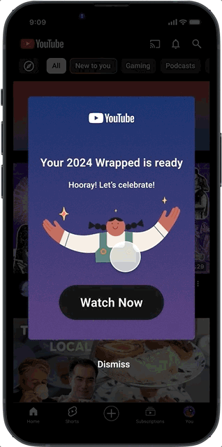
The end result was a design that celebrated the user’s year on YouTube in an exciting and intuitive way— previewed below!


Final screens of feature: categories, minutes watched, channels, comparison to worldwide data, personality type, summary image
Creating YouTube Wrapped was a fun challenge that enhanced my skills in prototyping, business practices, and user experience design. This project reinforced the importance of designing for user engagement while staying true to the platform’s unique identity. By taking a hypothesis-driven approach, I was able to validate design ideas through research and testing, ultimately creating an experience that was not only functional but also emotionally resonant for users. Moving forward, I’d look at how to scale this concept, potentially incorporating more interactive elements and deeper user customization.


