
Header preview of the Saya app, showing mobile final screens
Mental health is as important as physical health because they are deeply interconnected. Over time, poor mental health can contribute to or exacerbate physical conditions like heart disease, stroke, and other health issues. Yet despite this, many people struggle to prioritize their well-being while balancing work, family, school, and other responsibilities.
This project is guided by the idea that a straightforward app offering mental health resources and tools might help users better support their well-being day to day. The challenge is that mental health is complex and often very serious—every individual’s needs are different, and no single app can meet them all. Instead, this app is designed as a stepping stone: a way to access resources, build awareness, and gain a better understanding of one’s mental health. It is not intended to replace therapy or professional medical care.


Animated examples of the screens, walking through the prototype
I conducted 5 interviews with potential users who care about their mental health, along with conducting an anonymous survey to 13 respondents. I wanted to gain a better understanding of the how and why behind what users do, particularly looking into:
1) What kinds of self-care practices do they engage in?
2) How do users prioritize their mental well-being?
3) What are their pain points with taking care of their mental health?
I grouped similar interview responses together in order to find themes and trends. Categories/themes I found included “self-care”, “routine and progress”, “challenges and barriers”, etc.
The main user pain points for taking care of mental health were:
- Time management
- Feeling overwhelmed, tired, distracted, unmotivated
- Financial barrier
While the main user motivations for taking care of mental health were:
- Engaging in community
- Having fun (hobbies)
- Introspection (therapy, meditation, breathing)
- Physical benefits (sleep, exercise, hygiene, beauty)
- Seeing progress and self-improvement

Organized categories showing common themes among participants' experiences surrounding self-care & mental health
I synthesized the findings into an affinity map, which revealed a few clear takeaways:
1) Users wanted tools that blended into daily life. Many struggled with consistency and looked for support that was structured but low-effort.
2) Self-care was often quick and accessible. Things like listening to music, exercising, or connecting with online communities were common. Users wished mental health apps felt as easy and natural as scrolling social media.
These insights guided me to design an app with simple, flexible tools that fit into busy routines and make it easier for users to stay consistent with their mental health.

Flow chart for the app, mapping the different paths users can take
I began to brainstorm features and mapped out the structure of the app. The main flow centers on two main actions: 1) identifying emotions and 2) accessing mental health tools and resources. From there, all features branch out in a straightforward way, with an optional premium path that tracks emotional trends over time and offers personalized guidance.
To ensure Saya’s approach aligned with evidence-based strategies, I referenced mental health professional websites and research-backed resources.
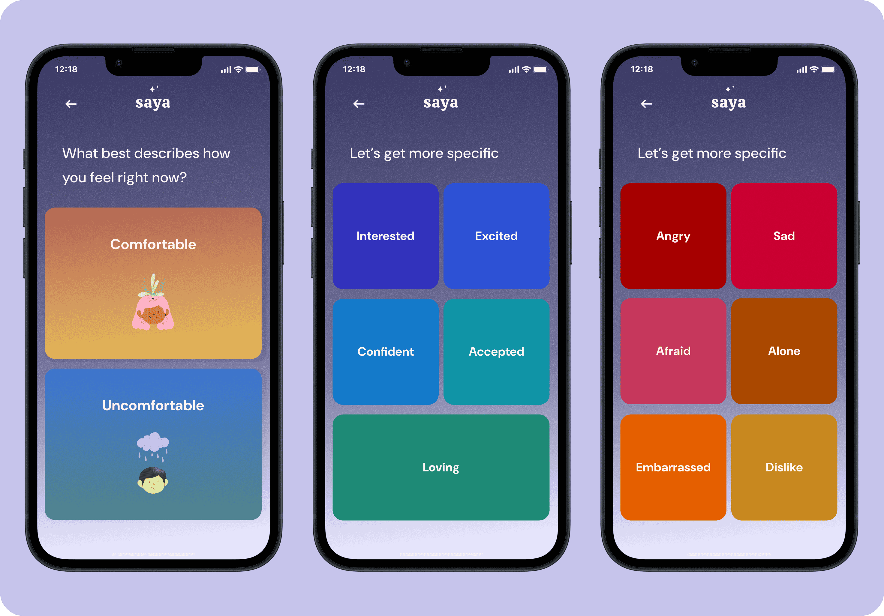
One example is the Feelings Wheel—a simple visual guide that breaks emotions down into core feelings in the center (like joy, anger, or sadness) and then branches out into more specific emotions. It helps people put words to what they’re feeling, which can make it easier to process and talk about. This idea shaped Saya’s emotion check-in feature, giving users a way to pause and name what they’re experiencing in a clear visual manner.

The Feelings Wheel by Dr. Gloria Willcox; color-wheel of emotions used as a tool to help identify & process complex feelings
Now it was finally time to start designing! I began with brainstorming a few different brand values for Saya, which were: calm, trust, gratitude, and curiosity.

Mood board for Saya; with muted lavender, warm indigo, light red violet, pink, cream, & bright yellow ochre
From these brand values, I assembled my mood board. I was drawn to a textural pastel look, warm/happy colors like yellow/orange, and cool colors like indigo for contrast. I then took the inspiration from my mood board and began creating the elements for my UI kit: Saya’s logo, color palette, fonts, icons, buttons and components.

The full UI kit for Saya; with the logo, icons, components, color palette, buttons & fonts
I sketched many different versions to arrive to Saya's final logo design. Saya's name comes from the word masaya, meaning "happy" in Tagalog. I wanted the logo to reflect the feeling of happiness (orange/yellow gradient, soft rounded edges, reminescent of sunshine).
For my color palette, I was heavily inspired by the colors in my mood board: purples, pinks, oranges, and yellows (also ensuring it’s AAA-approved for accessibility).

Mid-fidelity wireframes for Saya mapping basic layout for the app; greyscale and simple shapes
I started by sketching low-fidelity key screens to quickly explore different ideas and layouts. I drew inspiration from minimalist mental health apps I found during my competitive analysis, focusing on simplicity and ease of use.
After sharing my sketches with my mentor, I received feedback on the clarity of the flow—specifically, making it clear what the homepage was, how users could return to it, the steps in the sign-in process, and what happened after completing the emotions check-in. With these points in mind, I refined the concepts into mid-fidelity wireframes, focusing on simplifying navigation and building a smoother, more intuitive journey before layering in colors, illustrations, and icons.
Iterations: Emotion check-ins before switching colors; positive emotions were warm tones and negative emotions were cool tones
Initially, I mapped positive emotions to warm colors and negative emotions to cool tones, based on the Feelings Wheel. My mentor noted that warm colors like red are often linked to negativity, while cool colors like blue feel calming. I updated the palette so calm, positive emotions use cool tones, and more intense emotions use warmer tones, making the app feel more intuitive.
I interviewed 5 users for my usability testing, along with receiving additional comments from my mentor. The overall consensus was there’s a strong brand identity that reads well with the app’s theme and purpose. I received some suggestions about building out more screens for the tools and check-in flows, and some minor suggestions like adding a check-in time to the homepage or adjusting the boxes to have a more symmetrical composition.
Utilizing this advice, I updated and finalized my high fidelity prototypes-- previewed below!

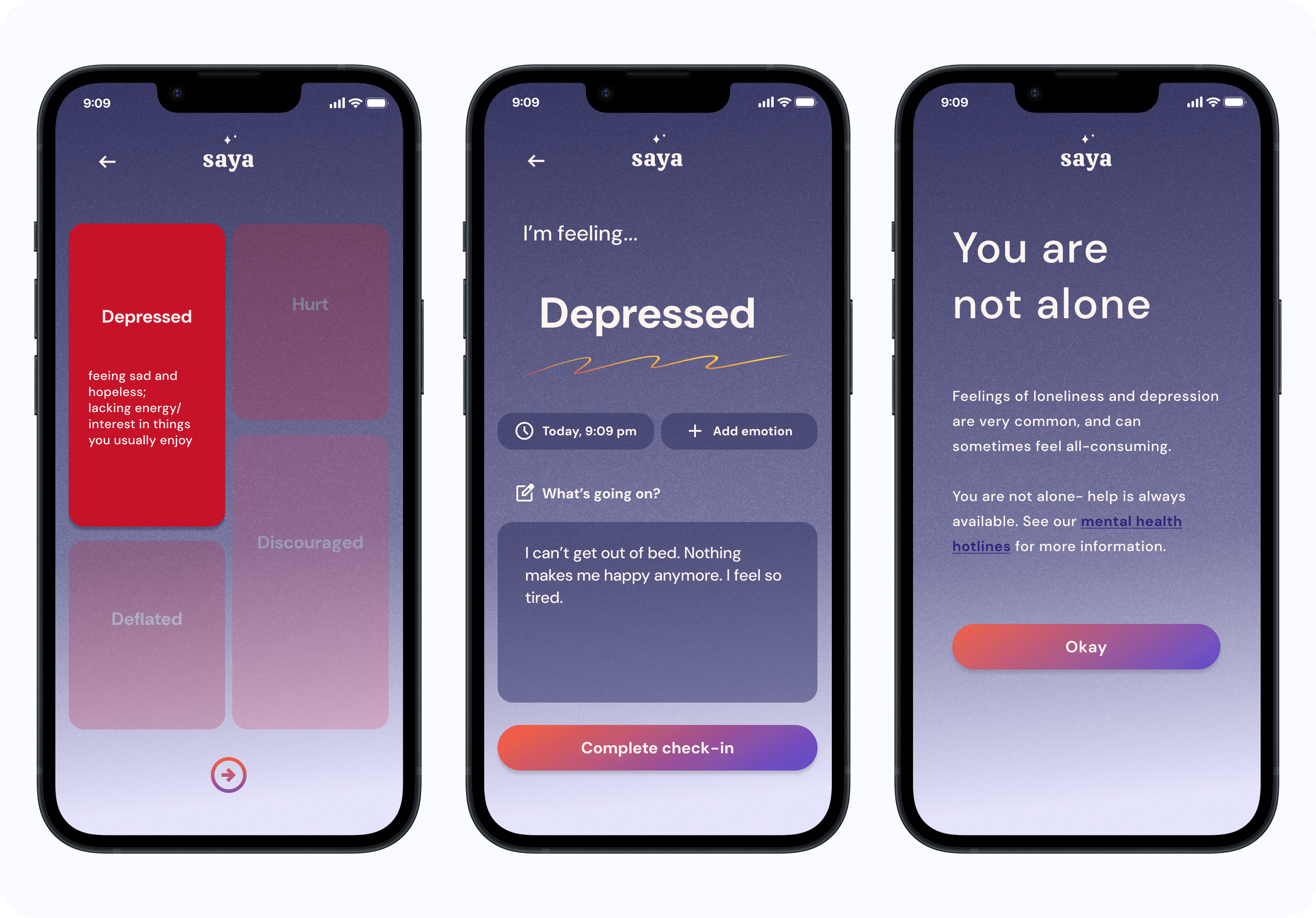

Final screens of app: welcome screen, emotions check-in, link to mental health resources & hotlines, tools & info to help improve mood
Creating Saya was a meaningful challenge that pushed me to grow not only as a designer but also as someone passionate about mental health. This opportunity deepened my skills in research, prototyping, and iterative design, while also reminding me of the importance of empathy in creating mental health tools. It also reinforced the value of making resources feel approachable, flexible, and grounded in evidence-based strategies.
Looking ahead, I’d expand on features like a detailed therapy resources page with sliding scale options, a sleep and wellness tool, a favorites option, and a more dynamic trends page. I’d also explore the business side of the app, from potential revenue models to partnerships that could help scale Saya into a sustainable resource for users.


