
Header preview of Little Green site redesign, showing desktop & mobile final screens
For this project, I worked with Little Green A Plant Bar, a local business that serves as an eclectic community space offering plants and coffee. The goal was to redesign their website to create a more user-friendly, visually appealing, and responsive experience that captured the brand’s laid-back and inviting vibe.
The challenge was with Little Green's original website— it was outdated, cluttered, and not optimized for mobile devices. My task was to redesign the site to improve navigation, provide a smooth user experience, and better represent the business as a place for people to connect, relax, and enjoy a cup of coffee.


Animated examples of the screens, walking through the prototype
I conducted user interviews with Little Green’s customers to gain a better understanding of their experiences navigating Little Green's website, particularly looking into:
1) What are their pain points?
2) How do they feel about the site's current visual appeal?
3) What features or functionalities are missing or lacking?

Organized categories showing common themes among participants' initial impressions of site, and suggestions for improvements
I grouped similar interview responses together in order to find themes and trends. Categories/themes I found included their “likes”, “dislikes”, “wants”, and “suggestions.”
The main user dislikes I observed were:
- Too much scrolling
- Spacing inconsistencies
- Outdated information
- Lack of clarity with information
While the main user likes I observed were:
- Visuals
- Photography
- Colors
- Classes and events
Users appreciated Little Green’s visuals and events, but prioritized clear, organized information. Pain points like excessive scrolling and outdated details highlighted the need for a more seamless, trustworthy experience without losing the brand’s identity.
Building on the insights from my affinity map, I created a customer journey map to visualize how a user might interact with the site. A journey map outlines each step of the process, highlighting goals, frustrations, and emotions along the way. Its purpose is to reveal gaps in the user experience and uncover opportunities for improvement that serve both the user and the business.

Customer journey map of Joni’s workshop sign-up experience, showing difficulties and opportunities
For example, I mapped out Joni, a user hoping to sign up for workshops and stay informed about upcoming events. Her journey surfaced clear pain points: no newsletter sign-up, no events calendar, and some uncertainty about the registration process. Addressing these gaps through solutions like monthly newsletters, event promotion on the site and social media, and automated email confirmations would give users a smoother, more reliable experience while boosting attendance, repeat engagement, and community connection.
The main priorities will be strengthening and maintaining their brand identity through the site's color palette, along with using high quality photos of the space and the products they have to offer. More simplicity and organization with the layout will help with readability and clarity.
Features of Little Green:
- Events calendar
- Highlighted upcoming events
- FAQ
- Submission form for rental inquiries
- Clear contact information
- Sign up for monthly newsletter
- Instagram integration for updates

Mood board for Little Green; with warm ambient lighting, natural & vintage elements, dark cool greens & browns
Now it was finally time to start designing! With input from the owners of the store, I began with brainstorming a few different brand values for Little Green, which were: community, unique, and quality.
From these brand values and the aesthetics of their in-store decor, I assembled my mood board. I was drawn to dark and warm natural colors and themes, like pine green and wood. Their ambience feels eclectic, vintage, and inviting.

Style tile for Little Green site redesign; with the components, color palette, buttons & fonts
I took the inspiration from my mood board and their logo and began creating the elements for my style tile: Little Green’s color palette, fonts, buttons and components.
My main task was to make the stye tile feel cohesive with their already established brand identity. I used a serif font for headers, and incorporated the logo’s plant outline design as a motif throughout the design. For my color palette, I decided on incorporating different shades of green with a pop of yellow gold, reminiscent of their logo (also ensuring it’s AAA-approved for accessibility).

Mid-fidelity wireframes for Little Green site, mapping basic layout for screens; greyscale and simple shapes
I started by sketching low-fidelity key screens to quickly explore different ideas and layouts. I drew inspiration from other local, trendy plant/coffee shops I discovered during my competitive analysis. I focused primarily on simplicity and ease of use.
After sharing my sketches with my mentor and getting feedback, I refined the concepts into mid-fidelity wireframes. At this stage, I focused on making the structure and user flow clear before bringing in colors and imagery.
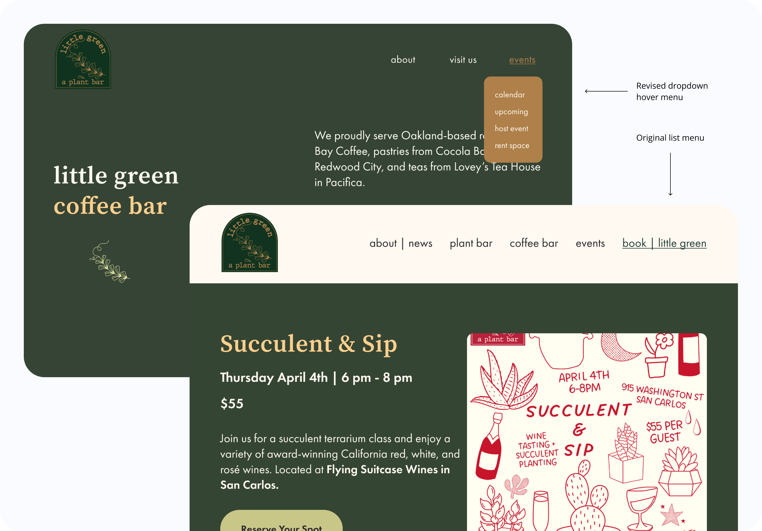
Iterations: simplified hover drop down menu, instead of cluttered list menu
In my mid-fidelity wireframes, I first designed the navigation menu as a long list, but it felt cluttered and took up too much space. To simplify the experience, I reorganized the menu into three main categories, each with dropdown options (e.g., the calendar under Events). This made the navigation cleaner and easier for users to scan through.
I interviewed 5 users for my prototype usability testing, along with receiving additional comments from my mentor. The overall consensus was the color scheme is visually appealing and the website has a friendly vibe. The users liked the event calendar and the layout of the classes/events. However they felt that overall there could be more consistency with spacing and a greater use of visual hierarchy.
Through my iterations, I redesigned the homepage to feel simpler and straight forward, adding clear sections that preview each of Little Green’s offerings—classes, markets, coffee, and the plant bar—so visitors immediately understand what the shop provides. I also made sure the spacing on both desktop and mobile screens were consistent throughout the site. Utilizing all of this feedback, I updated and finalized my high fidelity prototypes -- previewed below!


Final screens of desktop site: about us & FAQ, space rental options, calendar and upcoming events

Final screens of mobile site: store hours and location, pricing for plant bar, highlight images on homepage
After having a follow-up discussion with the client, I decided to add 1) banner for purchasing gift cards and 2) a separate section detailing their live music events. You can visit the Framer website prototype here.
Redesigning the Little Green website was an exciting first client project that strengthened my skills in designing responsive, user-friendly and engaging experiences. Knowing the brand helped me design with clarity while highlighting what makes the shop unique. The redesign emphasized clear navigation, accessible content, and a strong visual identity to better connect users with events, rentals, and the local community. Moving forward, I’d like to build on this work by exploring Little Green’s business goals, including revenue growth, marketing strategies, and potential partnerships.


